Category: Blog

  • Branding Yourself for a Dream Job – Houston SQL Server User Group

    I delivered a presentation for the Houston SQL Server User Group tonight, virtually from Colorado. I’d love to go down, but couldn’t do it today.

    The slides for the talk are here: BrandingDreamJob.pptx

    I had fun and thanks to the Houston group and Paresh for having me.

    A few interesting questions:

    Should you use your real name on Slack (or Twitter/etc.)

    There is no right or wrong answer here. For me, I want to tie together my efforts, so if I help people on Twitter, I want to link my resume/profile to my Twitter account. It’s why I keep way0utwest and try to get that on new platforms. My profile says “Steve Jones”.

    You can do what you want.

    What about using ChatGPT to write blogs?

    A great comment here from Paresh. I think this is a good way to get started and maybe sketch out a post. I would recommend this, though I think this needs to grow and improve.

    However.

    You don’t know if ChatGPT synthesized sentences and paragraphs from other information, which is what we all do. You also don’t know if it copied paragraphs verbatim from somewhere.

    My advice if you use this is plan on editing the result and making it your own.

    How do we network virtually?

    I’ve networked and built friendships online for years. In the SQL Server Central forums and similar places. Sometimes real time chat, sometimes asynchronous posts. However it works.

    If you can get to know people with messaging or posts on a platform, that’s great. If you come to a virtual group meeting, or even a company meeting, early, you can spend a few minutes in chat or live chatting with them. Ask a question, share something, solicit an opinion, or comment on something.

    In busy chats, or even aloud, you might @ someone or address them. In chat, @Steve, that was an interesting comment. Aloud, “Steve, have you ever used automatic seeing in an AG?”

     

  • Setting up a Local http Server with Node

    Setting up a local web server was something that I haven’t done in a long time and this was really easy. This post shows how to do this with a command line node web server.

    A Need

    Most software that needs a web server sets one up for you. This is pretty easy, and if I have a web app in Visual Studio, it will start up its own server when you run the app. If you had to set your own up, IIS was in many versions of Windows, but it wasn’t a simple thing to configure and manage.

    I like simple.

    I needed to just serve a file over http to test something. I could have done this by uploading a file to this blog or somewhere else, but I was hoping to keep this small and portable.

    Looking Around

    As always, I started with Google. I found a bunch of articles on Apache, python (should have tried this) and others. Then I saw this short article on a test web server on Windows. I looked, and this seemed to be something simple. I had node installed, so really I ran this:

    npm install -g http-server

    This installed somewhere. I had created a new folder in d:\http, but the web server was installed elsewhere. When I typed “http-server” in the command line, it seemed to be running. I saw this:

    2023-05-04 09_19_04-http-server

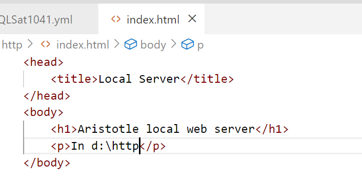
    I created a quick html file, index.html, with this content:

    2023-05-04 09_19_40-index.html - sqlsatwebsite - Visual Studio Code

    and voila, I had a web server.

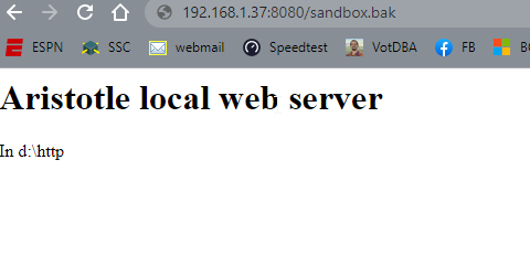
    2023-05-04 09_19_47-Local Server

    It’s basic, but any file I drop into d:\http can be served over http by entering the file name in the path. You can see in the image above, I was testing moving SQL Server backups. That URL actually downloaded that file from my browser.

    Summary

    This showed how you can set up a server with node. It’s quick and easy, and flexible. I can set this up as needed for tests without any big config. If you need this, here’s one way to test your own web stuff.

  • Stacked Bar Charts vs. Line Graphs–Which is Better?

    I ran across an interesting post from Rita Fainshtein that looked at the different types of graphs for a set of data. I thought that was interesting, so I ran my own experiment. I found for my data, a line graph was better, but let me know what you think.

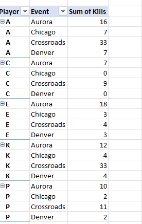
    My data set was simple, a few players across a few events and their number of kills. I coach volleyball and I’m always trying to present stats in a useful way. Here was the small set I picked.

    2023-05-04 15_26_09-Kills.xlsx - Excel

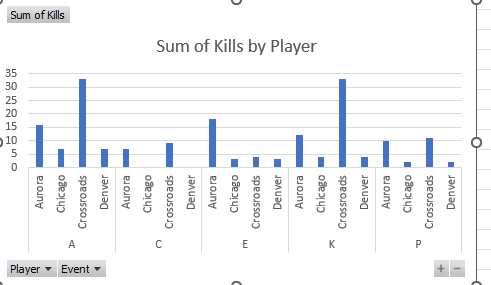
    Nothing fancy, but this is similar to what was in the article. From here, I asked EXcel to insert a chart from the Recommended Charts and picked the first one. This is what I saw:

    2023-05-04 15_17_10-Kills.xlsx - Excel

    This isn’t bad, though it’s hard to compare across events. I see how A did for all these events, but if I want to see if she was better or worse than K, I’m guessing on some of the lines.

    Next, I opened Power BI. I added my data set and then dragged a value to the visualizations. The default chart I got was similar to Excel. Not a great visual. It’s Ok, but suffers from similar problems.

    2023-05-04 14_05_01-Untitled - Power BI Desktop

    I moved the player and the event from the axis to the legend, because that’s more appropriate for this dataset.

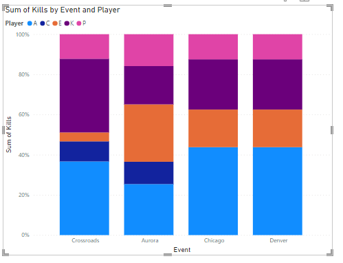
    I changed the type to the first stacked chart I saw, and got this, which I think isn’t useful at all. There isn’t a way to measure 100% in this case, so normalizing all data in this way is very unhelpful.

    2023-05-04 14_06_13-Untitled - Power BI Desktop

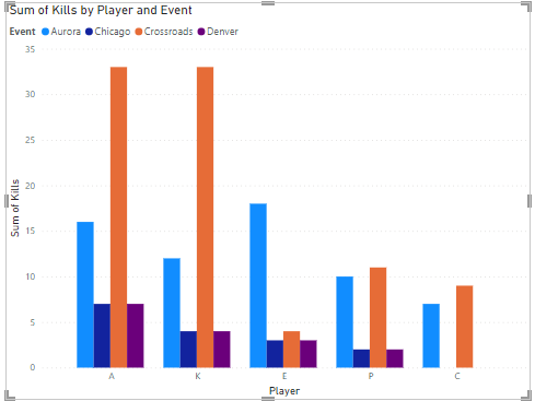
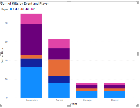
    I switched to a normal stacked chart, which is OK, but for Crossroads, is A or K better? Does E outperform A in Aurora? Very hard to tell.

    2023-05-04 14_06_18-Untitled - Power BI Desktop

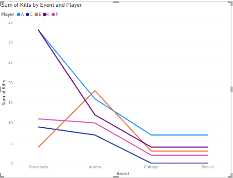
    Next I tried a line chart. This I think is the best for my analysis. I can see the events across the bottom and the colors for the players make it easy for me to compare them with each other. I am not color blind, so this works for me.

    I can also compare the players individually across events by following the lines. I can see them all trending in similar ways, which is expected. If the team does well, everyone does better. If not, then not. I also see the outlier where E outperformed A.

    2023-05-04 14_05_45-Untitled - Power BI Desktop

    Summary

    The line graph worked best for me. However, the data I am looking at lends itself to a comparison that looks good here. The stacked bar chart isn’t as clean when drawing conclusions, but that’s because I’m looking at the different segments across items, not necessarily with segments for the same item. Of course, I think that would be hard as well.

    Ultimately the data you are analyzing and how the analysis is used will affect what you think is better. Work with the people who use your visual to make a decision and let them help guide you for the best visual.

    In this case, A loves seeing she’s ahead almost all the time.

  • A New Word: Trumspringa

    trumspringa – n. the longing to wander off your career path in pursuit of a simple life, which is just the kind of hypnotic diversion that allows your thoughts to make a break for it and wander back to their cubicles in the city.

    Such an interesting word. I know I had this when I was working at JD Edwards (and later Peoplesoft) in Denver. My wife certainly had it. In some sense, she’s made this come true and it’s no longer a longing. It’s semi true for me, though I still work at a desk.

    Coping with stress and struggles have had me often thinking what else could I do. I still do this a little, though not more than just as a diversion since I have a great job. More now I look to find ways to actually wander away and try something new.

    From the Dictionary of Obscure Sorrows