Tag: data visualization

  • Presenting Data

    Many of us that develop or manage database systems are concerned with the actual bits and bytes that compromise data. However our clients and customers are more interested in the information, in gaining knowledge from the numbers, strings, and dates that are kept in our database tables.

    I really think that one of those things that can truly allow a developer or DBA to show their employer they are valuable to the organization. Employees prove this when they can retrieve information in a way that clients find valuable. Not that we, as the technical people value, but in the ways that clients find valuable.

    This doesn’t mean you need to learn PowerBI or PowerPivot or any other Power tools, but that you learn how to present the data you work with in the best way you can. Whether that’s in an SSRS report, an Excel worksheet you email around, or a complex visualization, all of these formats have one thing in common: a query. One of the best things you can do as a developer or DBA is ensure you can write efficient queries that assemble data from a variety of tables in different formats. Queries that retrieve data that can answer a question or reveal a pattern.

    Learning how to build a fancy visualization is great, but be flexible. If you get the opportunity, work with a new technology and develop some comfort, take it. However make sure that above everything else you can get the data sets to the end user. Clients can always use their own tools, but the efficiency and performance they experience will often come down to your query writing skills.

    Make sure you are constantly improving those skills.

    Steve Jones

    The Voice of the DBA Podcast

    Listen to the MP3 Audio ( 2.0MB) podcast or subscribe to the feed at iTunes and LibSyn.

  • Infographics

    A few years ago I went to a seminar from Edward Tufte that talked about information and how we can better present it to people to convey information and help make better decisions. I was fascinated by the talk, loved many of the examples, and then didn’t get to do much with it. I found that it was hard to come up with ways to convey lots of information, and more importantly, it was time consuming to try and build incredibly dense visualizations.

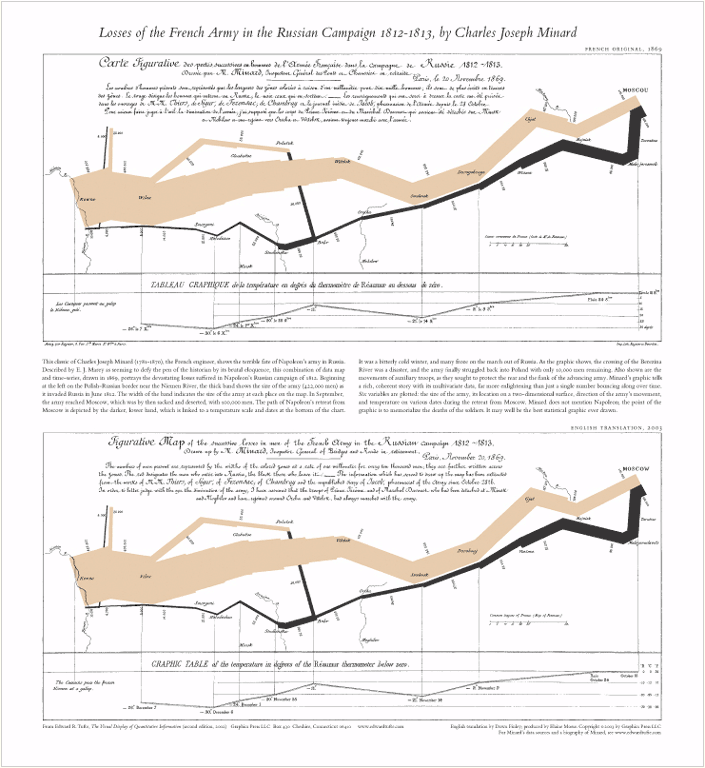
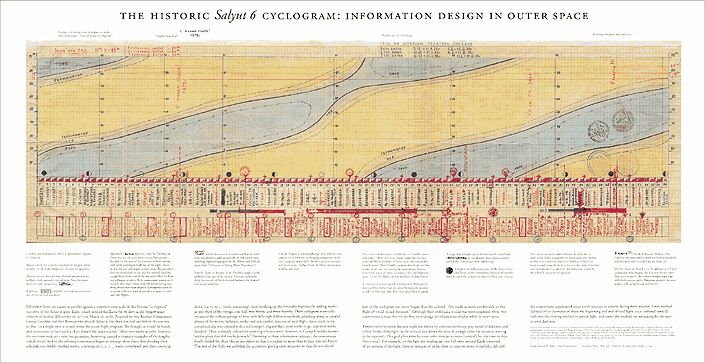
    I thought this graphic of Napoleon’s army and this one of the Salyut 6 flight were interesting, but I wasn’t sure how they’d translate to any of the business world’s I’d worked in. However, I know I’ve seen some very helpful infographics and visualizations over the years, and I’m sure you have as well. This week, I’m wondering:

    What is an infographic (or visualization) that you found to be both visually pleasing and very useful?

    It could be an animation, a static image, or something else. I know a couple of the videos I’ve seen were amazing. One of Europe’s borders and another of nuclear detonations presented a lot of information in a very eye-catching way. I also enjoyed this one on traffic.

    Let us know which ways of presenting information or visualizing data have been most noticeable by you.

    Steve Jones

    Video and Audio versions

    Today’s podcast features music by Everyday Jones. No relation, but I stumbled on to them and really like the music. Support this great duo at www.everydayjones.com.

    Follow Steve Jones on Twitter to find links and database related items and announcements.
    Steve Jones Windows Media Video ( 13.5MB) feed

    MP4 iPod Video ( 16.0MB) feed

    MP3 Audio ( 3.4MB) feed

    Feeds are available at iTunes and Mevio

    To submit an article, rant or editorial,
    log in to the Contribution Center

  • Cool Data Visualization

    I attended a course from Edward Tufte a few years ago on Data Visualization, and while I learned some neat things, I never was able to implement them well. I think part of it is a complete lack of an art gene in my person, but I do keep it in mind sometimes and would like to actually implement some of the ideas in his books.

    Today someone at Red Gate posted a link to this very cool data visualization on wind. It shows the wind speeds on days for the entire US, but in a very visual way. This is what it looks like, but if you go to the site, you’ll see it animated.

    wind

    There’s also a gallery of some days in the past to view.

    It’s neat because unlike a chart, or a static picture, you can easily see where wind is flowing, and the intensity for a large area. You can zoom in to see what the speeds are in a particular area.