Tag: visualizations

  • A Quick Look at Travel

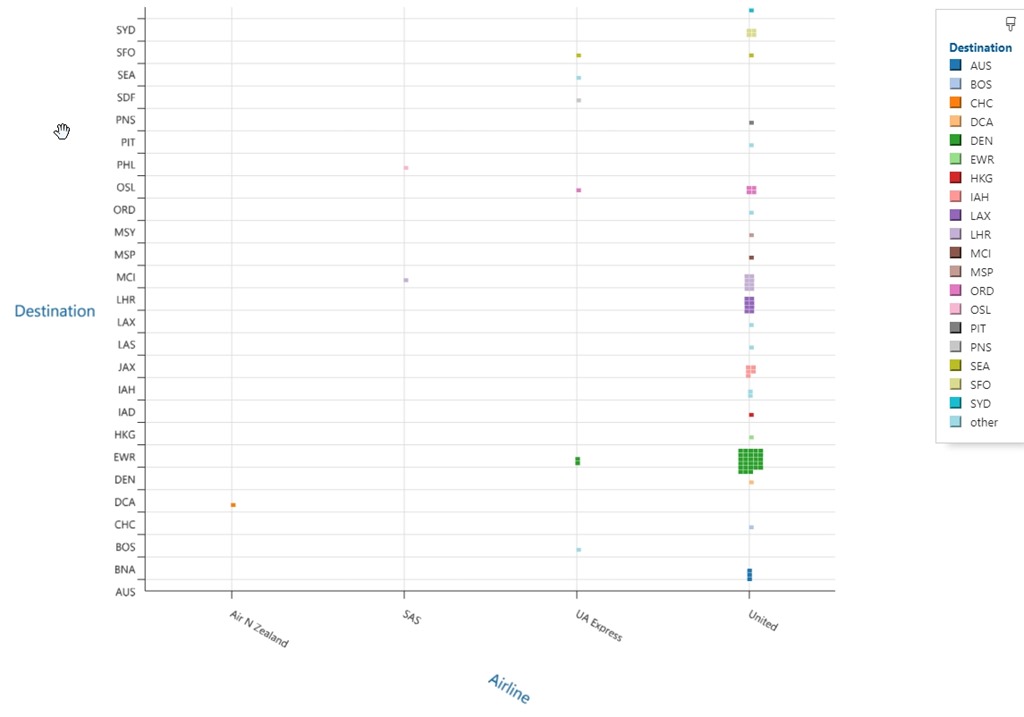
    I was experimenting with visualizations the other day, and started playing with SandDance, a tool from Microsoft that you can use in Power BI or Azure Data Studio. I’ll write more, but I loaded up a quick look at the last couple years of travel for me. Here are airlines v destinations:

    2019-11-25 16_02_17-SandDance_ unitedactivity.csv - Sample Data - Azure Data Studio

    Since I live in Denver, obviously that should be my top destination, but a few others are surprising. I go to London quite a bit, but LAX was surprising to me. It shouldn’t be, as I’ve flown through there quite a few times to get to London.

    I’ll write more about this later, but I thought this was an interesting visualization.

  • Infographics

    A few years ago I went to a seminar from Edward Tufte that talked about information and how we can better present it to people to convey information and help make better decisions. I was fascinated by the talk, loved many of the examples, and then didn’t get to do much with it. I found that it was hard to come up with ways to convey lots of information, and more importantly, it was time consuming to try and build incredibly dense visualizations.

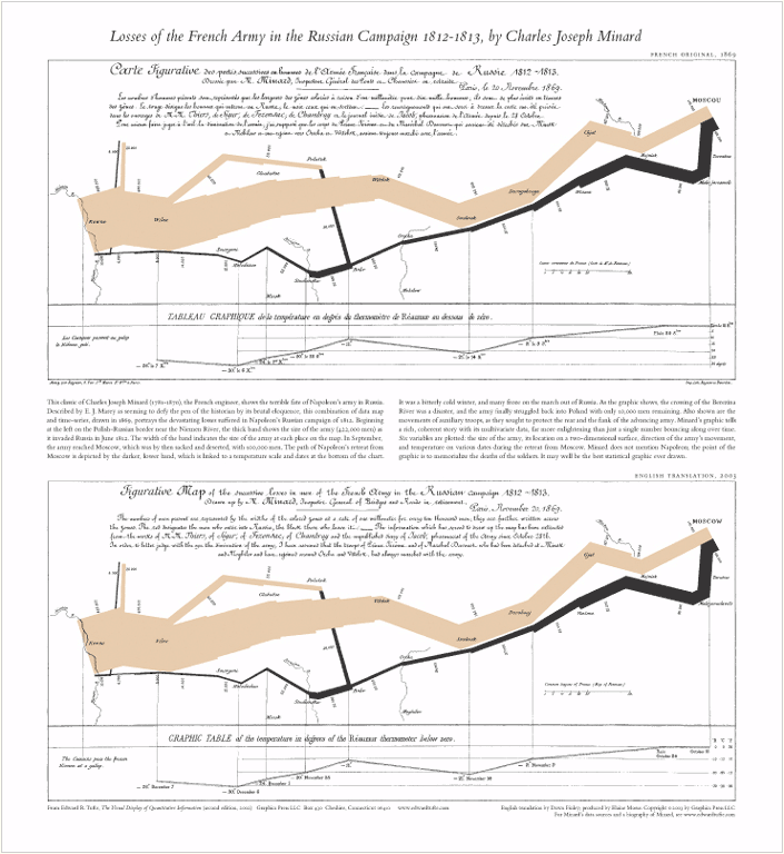
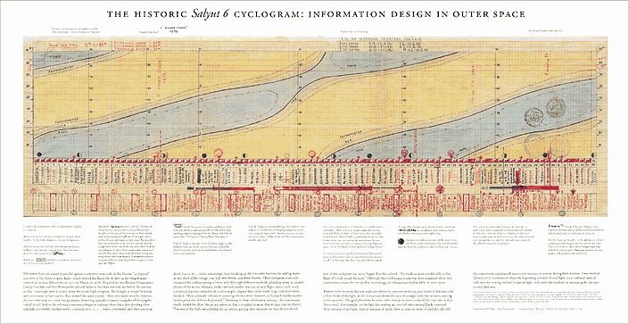
    I thought this graphic of Napoleon’s army and this one of the Salyut 6 flight were interesting, but I wasn’t sure how they’d translate to any of the business world’s I’d worked in. However, I know I’ve seen some very helpful infographics and visualizations over the years, and I’m sure you have as well. This week, I’m wondering:

    What is an infographic (or visualization) that you found to be both visually pleasing and very useful?

    It could be an animation, a static image, or something else. I know a couple of the videos I’ve seen were amazing. One of Europe’s borders and another of nuclear detonations presented a lot of information in a very eye-catching way. I also enjoyed this one on traffic.

    Let us know which ways of presenting information or visualizing data have been most noticeable by you.

    Steve Jones

    Video and Audio versions

    Today’s podcast features music by Everyday Jones. No relation, but I stumbled on to them and really like the music. Support this great duo at www.everydayjones.com.

    Follow Steve Jones on Twitter to find links and database related items and announcements.
    Steve Jones Windows Media Video ( 13.5MB) feed

    MP4 iPod Video ( 16.0MB) feed

    MP3 Audio ( 3.4MB) feed

    Feeds are available at iTunes and Mevio

    To submit an article, rant or editorial,
    log in to the Contribution Center

  • Visualizations

    thousandwordsThey say a picture is worth a thousand words. An image can convey an incredible amount of information, though the interpretation can vary widely depending on the viewer’s perspective. However images can often condense information into a much smaller space. One that is often clearer to many people than a large spreadsheet or numbers or pages of words.

    Visualizations can help us understand and consume a large amount of data quickly. They don’t always provide all the information we need for a decision, but they make it easier for us to understand where we should look deeper. There’s a great piece on how visualization tools help us understand big data, and also a tour of visualization methods (thanks to Brent Ozar, PLF).

    Many of us are working with larger and larger amounts of data, and being asked to help business people find tools or methods to work with data. We’re also writing lots of reports to extract information, and I wanted to ask this question:

    What visualization methods do you prefer working with?

    If you have more than one, let us know, and if you have preferences for certain types of data or analysis, let us know. If you’ve found some techniques that don’t work well or mislead people, let us know about those as well.

    Images, animation, color, and more can really improve the transfer of information, but it’s not always as useful as we might think. One of the points brought up in the editorial linked above is that our tools and visualizations need to account for uncertainty in the data quality. I don’t know what methods and tools we’ll use in the future, but I do know that our choices continue to grow in the SQL Server space as new tools like Power View and Geoflow are released.

    Steve Jones


    The Voice of the DBA Podcasts

    We publish three versions of the podcast each day for you to enjoy.