Tag: visualizations

  • The Best Graph

    Conveying information is a bit of an art and science. Many of us have written reports, graphs, charts, etc. at some point in our career. We’ve likely created some good ones and some bad ones that our clients love or hate. Perhaps if you’re like me, you make a small attempt and then ask someone else to clean it up for you.

    However, visualizations are important. In the modern world, many people want a visualization instead of a table of data, or at least alongside a table. That means we want to ensure we are conveying information well and not just picking the prettiest picture.

    One interesting thing to consider is how different types of graphs affect how we process information. There was a post from Madiera Data that looked at how different graphs helped someone analyze the data. It starts with bar graphs, which have been very popular in the last few years. They are appearing in lots of business dashboards, news articles, and more. They can be useful in some situations, but not all. Especially when trying to compare the different segments.

    Instead, other visualizations can be better. The article shows table graphs are working well. I conducted my own experiment with visuals, and I found a line graph was easier to use. However, that was for my data. Your data might need different visuals if you use it differently.

    I don’t think there is a best graph, but there can be a best graph for a particular data set and a particular client(s). The way someone makes decisions based on a visual could dictate what works best. That’s my advice: work with your clients.

    For good general advice, I think you should lean on https://www.storytellingwithdata.com/, Meagan, and resources such as Edward Tufte, who have spent a lot of time thinking, experimenting, and understanding how to convey information visually. You could learn a lot from them.

    Steve Jones

    Listen to the podcast at Libsyn, Stitcher, Spotify, or iTunes.
  • Stacked Bar Charts vs. Line Graphs–Which is Better?

    I ran across an interesting post from Rita Fainshtein that looked at the different types of graphs for a set of data. I thought that was interesting, so I ran my own experiment. I found for my data, a line graph was better, but let me know what you think.

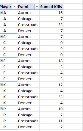
    My data set was simple, a few players across a few events and their number of kills. I coach volleyball and I’m always trying to present stats in a useful way. Here was the small set I picked.

    2023-05-04 15_26_09-Kills.xlsx - Excel

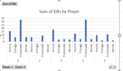
    Nothing fancy, but this is similar to what was in the article. From here, I asked EXcel to insert a chart from the Recommended Charts and picked the first one. This is what I saw:

    2023-05-04 15_17_10-Kills.xlsx - Excel

    This isn’t bad, though it’s hard to compare across events. I see how A did for all these events, but if I want to see if she was better or worse than K, I’m guessing on some of the lines.

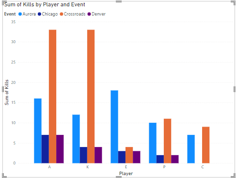
    Next, I opened Power BI. I added my data set and then dragged a value to the visualizations. The default chart I got was similar to Excel. Not a great visual. It’s Ok, but suffers from similar problems.

    2023-05-04 14_05_01-Untitled - Power BI Desktop

    I moved the player and the event from the axis to the legend, because that’s more appropriate for this dataset.

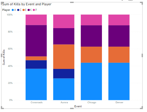
    I changed the type to the first stacked chart I saw, and got this, which I think isn’t useful at all. There isn’t a way to measure 100% in this case, so normalizing all data in this way is very unhelpful.

    2023-05-04 14_06_13-Untitled - Power BI Desktop

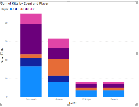
    I switched to a normal stacked chart, which is OK, but for Crossroads, is A or K better? Does E outperform A in Aurora? Very hard to tell.

    2023-05-04 14_06_18-Untitled - Power BI Desktop

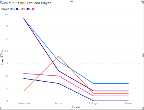
    Next I tried a line chart. This I think is the best for my analysis. I can see the events across the bottom and the colors for the players make it easy for me to compare them with each other. I am not color blind, so this works for me.

    I can also compare the players individually across events by following the lines. I can see them all trending in similar ways, which is expected. If the team does well, everyone does better. If not, then not. I also see the outlier where E outperformed A.

    2023-05-04 14_05_45-Untitled - Power BI Desktop

    Summary

    The line graph worked best for me. However, the data I am looking at lends itself to a comparison that looks good here. The stacked bar chart isn’t as clean when drawing conclusions, but that’s because I’m looking at the different segments across items, not necessarily with segments for the same item. Of course, I think that would be hard as well.

    Ultimately the data you are analyzing and how the analysis is used will affect what you think is better. Work with the people who use your visual to make a decision and let them help guide you for the best visual.

    In this case, A loves seeing she’s ahead almost all the time.

  • Better Communication of Information

    Many of us work with data in some way that helps a customer better understand data, use it to make a decision, or support a some conclusion. The way we present data (or help others present data) can impact how well a consumer understands the information represented by the data. There are people whose job it is to design visualizations and ensure the final product communicates well, but often I find a developer or DBA is the person that gets asked for help.

    What do we recommend when looking at a set of data and deciding how to format it? A few posts I saw recently help with decisions (when should I use a map) or basic knowledge (what is a square chart). I’ve seen presentations that help me understand the impact of my decisions and how to better design my informative reports for more people. In fact, I hope more people produce content on how and why they have built reports. It’s helpful for many of us that would like to do a better job.

    The other side of this is actually producing some report and then getting feedback on it. I’ve been working on a report for the kids I coach and need to write some blogs on the way I’ve built report and how I think others might use it. I certainly could use some feedback and I know someone will have suggestions on how to better structure a report, color it, choose a different style, or something else.

    I might even get some better feedback on how I chose to store the data. That certainly isn’t a set or known thing, and I would guess that there are some things I haven’t thought about in building a structure.

    Ultimately there is information to be gleaned from the data we capture, store, and manage. While it might not be our job to help convey that information, we are a part of the process and the more we know about it, the more we might do our jobs better, or help others do theirs better. I do hope that I see more posts on not only how to query information and solve problems but how to better present the data from those queries.

    I’m looking forward to some blog posts, articles, or maybe even someone hosting a T-SQL Tuesday on this topic.

    Steve Jones

    Listen to the podcast at Libsyn, Stitcher, Spotify, or iTunes.
  • When to Use Zero

    I’m not great at building charts and graphs. I can build a basic chart, but I often depend on the tooling I use to size, scale, etc. appropriately for whatever I’m graphing. That, or I just use a basic graph that starts from zero and has some sort of linear scale. Or I just present a table of numbers.

    There are plenty of misleading charts, especially used by the media that want to show some particular aspect of data that suits the story they are reporting. Many of these misleading charts often don’t start at zero, and they end up scaling in a way that can confuse people.

    You wouldn’t think it was hard to decide whether or not to scale a graph of data from zero or not, but it can be complicated, as this post shows. There is a flowchart to help you decide when to include zero, or even when to have an inset chart that better explains the data. As many of us know, it can be easy to misinterpret data, especially when someone else is deciding what to show.

    In this case, the post talks about some examples of when the data doesn’t graph well because the scale is too large and the range of data too small. Or when the scale distorts the relative size of two values in a graph. In all of the examples, it makes perfect sense why you do or do not include zero on your axis, but I don’t know that I know when I should or shouldn’t do this.

    Part of the problem for me is that people often glance at visualizations and charts without spending enough time to really study them. That’s part of the idea of a visual, in that we can get information quickly from a picture, as opposed to a chart of numbers. However, it is still easy to look at a broken scale or inset chart and not spend the time to comprehend that one value isn’t twice another, but instead realize the chart is zoomed in because the scale changed. There isn’t a perfect way to present information, but there are ways that might work better.

    To me, a lot of misunderstanding gets cleared up when we discuss the chart and the data in a group. Often one person will realize when others are not reading the scale when drawing their conclusions and remind others that Canada isn’t twice as large as Brazil. That works if people speak up and if others listen. That isn’t always the case, especially when the boss is making a mistake. The other issue is that many of us might look at a chart by ourselves. and we are unlikely to tell ourselves we are misreading the values.

    There isn’t a good way to ensure people read a scale and factor that into any decision they make regarding the chart. I do always like to include some data with a visual, that way I can see raw numbers on the same report, or by drilling in. The combination works well for me, but I’m a geeky, numbers person. I like seeing data, which is why I like working with databases.

    Steve Jones

    Listen to the podcast at Libsyn, Stitcher, Spotify, or iTunes.