Tag: data

  • JSON Has a Cost

    JSON seems to be everywhere these days. Many application developers like it across all sorts of languages, C#, JAVA, Python, and more. They use it for transferring information between systems, and are comfortable serializing hierarchical object data into JSON from text and de-serializing it back into its various elements.

    For those of us working in relational databases, JSON seems like a blob of information that isn’t easily queried, indexed, or stored. We prefer working with a relational set of data, which brings us into conflict with software developers. We’d like them to convert their objects to a relational structure, and they’d like us to just work with JSON.

    SQL Server has added new JSON functions in SQL Server 2025, expanding the JSON capabilities from previous versions. PostgreSQL has JSON types for a few versions, as has Oracle. Lots of applications are storing JSON data in databases. Unlike XML, however, JSON seems to be working well (overall) as a data storage mechanism.

    Or is it?

    At a recent conference, one of the speakers noted that we do a lot of data movement these days, and there can be a high cost to this as we pay for both compute and network. This data movement often incurs a query cost to get information from the source system. JSON can exacerbate this issue as we may send more data than necessary, and we might find our compute engines don’t support predicate pushdown. Even if we index the JSON, we might still end up querying more data from disks to get what we need. Especially as we move a lot of data to warehouses and lakehouses.

    Using JSON can slow things down. It’s nice for storing a bunch of information quickly and easily, but as we need to work with specific parts of a JSON document, we would likely be better off de-serializing the important pieces into more structured formats that prevent duplication, are easily indexed, and can achieve quick query performance. Everything becomes a little smoother.

    JSON is great, and I do like it, but it’s not a substitute for relational systems and relational models.

    Steve Jones

    Listen to the podcast at Libsyn, Spotify, or iTunes.

    Note, podcasts are only available for a limited time online.

  • 2025 Wrapped for Steve

    I’ve often done some analysis of my year in different ways. Last year I had a series of posts (health, music, readingspeaking, travel). This year, I took last week off, and it’s been busy up until then, so I decided to get back to a wrapped post with a few more numbers and less writing around the important data.

    Speaking

    I do a lot of speaking, so here are the numbers.

    • 28 events attended
    • 36 presentations
    • 5 keynotes
    • 12 Simple Talks podcasts
    • 11 Redgate events – most of my year
    • 3 SQL Saturdays (only 3 Sad smile )

    This was a year that a lot of my time was spent with customers. I did some training and speaking for them, including at customer events, but not as much publicly. I can’t decide if I need to do more in 2026, but it’s something to consider.

    I have already submitted to 3 SQL Saturdays in 2026.

    Travels

    A big year of travel. Only two rough stretches, but otherwise I didn’t feel too stressed or burned out.

    • 74 flights (70 on United)
    • 110 nights in hotels
    • 5 nights on airplanes
    • 5 trips to the NYC area
    • 5 trips to the EU
    • Visited 5 different countries (plus the US)

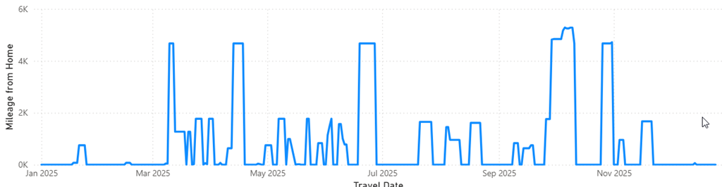
    A quick look at my year plotted as distances from home. Looks a bit like Seattle (I’ve been re-watching Frasier).

    2025-12_0211

    A good year with lots of vacation as well. I had a few breaks with my wife in these places, either for Volleyball or vacation.

    • New York
    • Greeley
    • New Orleans
    • Dallas
    • Cancun
    • Big Sur
    • Milan/Turin/Barolo

    Health

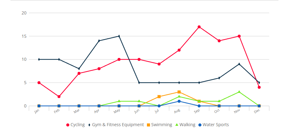
    I try desperately to keep myself healthy. A decent diet, not great, but I try for fresh foods and proteins/veggies more. I don’t track the diet well, but I do track activity with my watch. I also got a Peloton bike this year, which has helped. A quick graph of activities for the year:

    2025-12_0207

    It’s mid December as I write this, but I’ve done a good job of doing cycling early in the year and a bunch of yoga as well. I’ve been battling tendinitis in an elbow, so much less weight training than I’d like. A few numbers

    • Yoga – 66 sessions (once a week on average)
    • Cycling – 113, including 76 on the Peloton as of Dec 12
    • Swimming – 5 times, which sucks. Too much travel and not enough effort here
    • Weights – 42 sessions, mostly as I bailed in the middle of the year with the elbow. Trying to at least get back to legs regularly.

    I fell fairly healthy. My weight is slightly up, as I’ve fluctuated a bit with travel. My avg for the year is 228lbs, with a low at 224 and a high of 235.

    My heart rate averages 51 at resting and 122 at a high, mostly from exercise. Not bad. I had hoped for a sub 50 resting rate, which I see a lot of days, but not for the year. I think some stress from travel and long days likely keeps it from falling more.

    Music

    I love music and look forward to my Spotify Wrapped every year.  A few stats

    • 37,820 minutes listened
    • 364 genres
    • Pop Rap, Classic Rock, Alternative Country, and R&B where my tops
    • 4,200 songs tops were
    • 57 Albums (Death of Slim Shady was tops)
    • Top Artists: Zach Bryan, Tyler Childers, Eminem, Beatles, Kendrick Lamar, Jay-Z
    • 933 minutes of podcasts

    I didn’t get as much guitar or play as much as I’d have liked, but I did learn some new songs. Not great, but I did enjoy working through fingerpicking versions of The Sounds of Silence, Something (Beatles) and While My Guitar Gently Weeps. Those and a few Zach Bryan songs. I think I know as many from him as The Beatles.

    One interesting thing was my music age was 78. Apparently I like listening to older songs more than newer ones.

    Reading

    I spend a lot of time reading, especially on airplanes. I don’t consume a lot of visual media. Reading is a great escape for me. I tend to read a few non-fiction/career/business books each year, but those are work, so it’s usually just a few. I might add in some biographies, but mostly I love fiction.

    This year, as of Dec 19, I have read 148 books, which is a rise from previous years:

    • 2025 – 148
    • 2024 – 136
    • 2023 – 111
    • 2022 – 105
    • 2021 – 118
    • 2020 – 82
    • 2019 – 128

    A few stats from this year:

    Most read authors, which were mainly from series that I devoured on airplanes.:

    • Mathew Rief (29)
    • J N Chaney (26)
    • Gerald Kilby (14)
    • Jason Kasper (12)
    • Janet Evanovich (9)
    • Lee Goldberg (6)

    I had a number of re-reads as well from Jeffrey Deaver, John Sandford, Lee Child, and a few others that helped pass the time.

  • Be Wary of Data

    I fly a lot, as you might have guessed if you read my blog regularly. In 2025, I’ve been on 56 United planes as I write this, with about 10 left to go before the end of the year. One of the things United does is sometimes send out a quick “survey” after a flight, checking to see if everything went smoothly. I don’t always fill these out, but recently I decided to give some feedback as I had a great experience.

    I really wanted to just complement the onboard crew, but the survey was quite a few pages (10?) and a lot of questions. I started to try and fill it out, but lost focus after a few pages. This felt like a chore, and I started to just randomly click some of the selections asking me to rate things 1-10. I wasn’t really rating the items; I was trying to get done. Eventually, I bailed on the survey and didn’t complete it, but that got me thinking about the data from these surveys.

    I’m somewhat detail-oriented and I try to do a good job, but I couldn’t finish the survey. How many others just click through things and don’t really give an accurate picture of their feelings?

    A similar situation occurs at work, where we have an HR rating system (Thymometrics), which I really like. Over time, it helps me to keep an eye on how I feel about my job, the company, and my general attitude about work. We get quarterly reminders to fill this out, but I know quite a few people who don’t fill it out at all, or just click on it and save the ratings without thinking about them. Another place data might be suspect.

    At work we get feedback on various product metrics, in addition to uninstall feedback and product feedback, sometimes with a rating that people click. Is that what they really think about their experience or did they just click the first thing they saw? Or did they mis-click the wrong thing, and they can’t change their rating (clicking 2 when they meant 9).

    There is a lot of data that organizations collect from people that is very subjective. Across a large group of users, this should provide some sort of indication of how people feel, but if the sample sizes are small, can you really use this data? I think it’s easy for people in product management, marketing, and sales to view this data as much more accurate than it might be. I know I’m always wary of any outliers when I see feedback, and often I want to know how many people contributed.

    Unless it’s a decently large number (100s at least) and there is a clear trend from many people (> 5%), I tend to discount the data as an outlier and not representative.

    I’m not sure how many of you do this, but critically examine data and be wary of drawing conclusions. Especially when you are getting impressions, feelings, and opinions from others.

    Steve Jones

    Listen to the podcast at Libsyn, Spotify, or iTunes.

    Note, podcasts are only available for a limited time online.

  • Words vs Data

    I would guess that most of you reading this are very comfortable looking at data for insights and answers. You might even prefer to provide a result set instead of a picture or chart to a user when they are asking for help with data analysis. However, do you add any words to your analysis to help? Any descriptions, summaries, or conclusions that could be drawn from the data or the picture?

    I ran across a blog asking about the right ratio of words to data. The post uses the childhood story of Goldilocks and the Three Bears. Many of you might know the story and have drawn your own conclusions of what the story shows or means. If you read this post, you will find a very different interpretation. While some of you may not think that’s a valid interpretation, it’s possible that some thought that when they first heard the story.

    The point of the post is that we can provide data and pictures, but others might interpret things differently. Each of us has our own point of view, our own experiences, and our mood. That last one might lead us to focus on a piece of data or a part of the picture that the author didn’t intend for us to focus on, or didn’t think was relevant. Without any sort of guidance on the narration from the author, we don’t know how closely our interpretation matches theirs.

    Many of us have certainly seen others spin data, especially aggregates and statistics, to suit a narrative. However, the idea of providing some narrative isn’t to hide or mislead, but rather give context to what you see in the report. As the blog notes, don’t leave their interpretation to chance. Give them a “well-crafted, objectively reasonable narrative that is supported by your data.”

    Or, if you don’t have one, let them know that and ask them to send you one back showing what they see or what they expect.

    Steve Jones

    Listen to the podcast at Libsyn, Spotify, or iTunes.

    Note, podcasts are only available for a limited time online.