Tag: Power BI

  • More Power in Your BI

    I’ve seen lots of data visualization tools over the years. Cognos, Microstrategy, ProClarity, and more. While I haven’t been a BI person for most of my career, in many of my positions, someone has wanted to try some new tool and eventually I’ll get involved somewhat. I remember first seeing the OLAP cube browser in SQL Server 7, and showing my boss a quick demo. While it wasn’t something that you could let an end user have, it also got my boss excited, and they started a project as I was leaving to implement some OLAP for the sales department.

    When I first saw Tableau years ago (2008?) at TechEd, it was the first tool I’d seen that was really slick for the end user. I expected they’d grow quickly, and they have. Many people have looked at the Tableau tools as the standard for data visualization. For years nothing looked close, and as much as I appreciated Microsoft moving PowerPiviot and other tools to Excel, they weren’t as nice to use as the graphical tools.

    That changed with Power BI. When I first saw this tool, instantly I could start to see the power of the tool. Even altering and changing a tool had an ease and power that I hadn’t seen since the Tableau tools. The initial release had lots of limitations and was just on the web. It was slow, and refreshes from remote data weren’t great. There were security limitations, and I wasn’t sure that the vision for the product made sense from Microsoft, even though I could see tremendous potential.

    Things have improved, and I am somewhat amazed with the power of Power BI. A simple sales report is interactive. I can click on something intuitively and the values I see will adjust to focus on that item. What’s more, other graphs on the screen adjust. However, I don’t have to stick with simple graphs, I can add better imagry, such as this wine report, or this airline maintenance report that drives work. I was especially impressed with the analysis of Stephan Curry (which won the contest). Some of those reports I couldn’t imagine trying to build with other tools, especially SSRS.

    Power BI is a great tool, and if you need to provide visualizations for end users, I’d urge you to take a look. The Power BI Desktop tool is great for modeling and working with data. I find myself using that for quick looks at data, building a graph in a way that’s easier than in Excel. I went through Microsoft’s EdX course, and was somewhat amazed to see the vast capabilities available in the product. Guy in a Cube, Adam Saxton, has a YouTube channel where he and Patrick LeBlanc (@PatrickDBA) bring you constant training and tips on how to get the most out of the tool.

    What’s more, I keep finding more and more Power BI blogs and posts that I can add to Database Weekly every week. So many people are experimenting and finding ways to better analyze data with Power BI. This week we have a continent slicer, data privacy, collaboration, and more. With montly releases, I find that people are constantly digging into the possibilities and helping you learn with them. There are even developers building custom visuals that you can download. There’s even one for acquarium lovers. If you want to learn about these, Devin Knight blogs regularly about custom visuals and we include many of those links here and on SQLServerCentral

    Power Bi is a great way to empower your users, reduce your reporting load, and make everyone happier. Power BI is a great way to let users experiment with data and actually decide what reports are worth investing in more with IT resources to perhaps optimize the performance of certain visuals. Give it a try to day, especially the desktop version, and see how you can easily start to examine data that might be important to you. Even the SQLDBAWithaBeard finds Power BI helpful.

    Steve Jones
  • Power BI Week

    This past week was T-SQL Tuesday #75, with the topic of Power BI. There were some interesting posts, and we’ve included a few in this week’s newsletter. This was also the week where the winners of the Power BI report contest were announced, and it was a good entry. This was the one I actually thought was the best one. If you haven’t seen it, take a few minutes and go look at the entry and play with the data. It’s interactive, so be sure to see how well the Denver Nuggets have competed against Mr. Curry.

    I first looked at Power BI last summer, watching a presentation and being intrigued at the ability of the tool to easily get data from web pages. I then talked with a friend that works with Power BI regularly, and they showed me how to loop and gather information from many pages, easily assembling the data into a dashboard that was interactive. I was very impressed, and I’m looking forward to doing a bit more work on the platform myself.

    Quite a few people have been concerned that the development of tools like Power BI mean that there is less of a need for IT staff. I find myself thinking quite the opposite. There will always be data quality issues with something like Power BI, and there is a certain level of programming to build more complex reports. Not to mention the refresh and update process is slow, which can make the tool feel cumbersome.

    However users will find some reports are more useful, or more important, and need some help from technology professionals. Whether that’s developing more DAX formulas and measures to enrich displays or just providing stable, clean data sources that consolidate data from various places, there will be plenty of work for IT staff that support companies using Power BI.

    To me, Power BI is the type of tool that empowers users and lets them experiment a bit on their own. Once they determine what they really want, then they can engage me to build a more robust, reliable, and useful tool that helps the business.

    Steve Jones

  • T-SQL Tuesday #75–Power BI

    This month’s host is Jorge Seggara, the @sqlchicken, who works for Microsoft. A busy schedule caused a slight delay, so we’re posting the third Tuesday of this month, but that is OK. This is a great topic for T-SQL Tuesday.

    Power BI Data

    While Power BI is a great visualization tool, you can’t do anything without data. That means you need to find data, which is both easy and hard. Easy if you’re working within your own organization on a specific project. Slightly more complex if you want to look at data out in the world.

    However I saw this in a talk last year and I was amazed. This is the type of thing I’ve written before, and it’s cumbersome and problematic. I would think that SSIS would have made things this simple years ago.

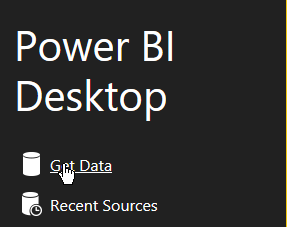
    I love sports, and wanted to play with some sports statistics awhile back. Finding good data is tough, at least in a format like CSV, that you can easily import. However Power BI makes this easy. Start up the desktop and you’ll see this:

    2016-02-10 14_07_40-Calendar

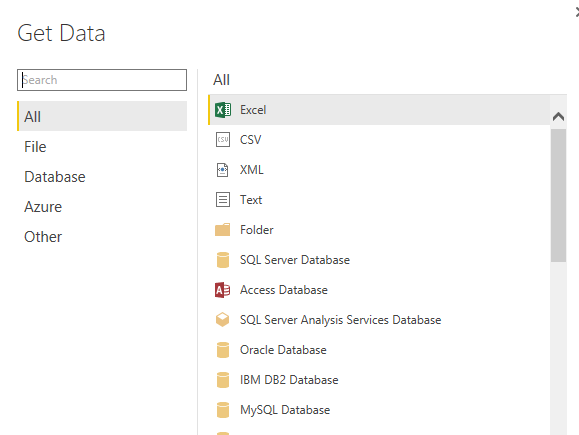
    Right away Power BI wants to get data. Click on this and the Get Data dialog opens, with lots of choices.

    2016-02-10 14_07_57-

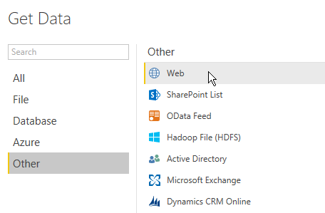
    However if you pick “Other”, you’ll see one more that I love. Web.

    2016-02-10 14_13_55-Calendar

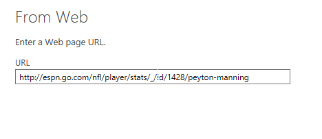
    Click this. You get asked for a URL. Any URL.

    2016-02-10 14_14_35-Calendar

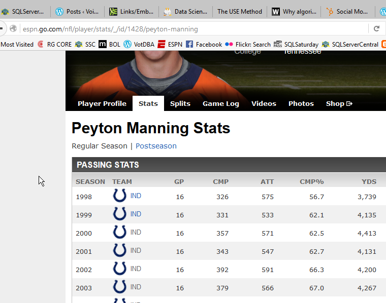
    I happen to have one handy. After the win for Denver in Super Bowl 50, I thought I’d look back at Mr. Manning’s career.

    2016-02-10 14_14_44-Calendar

    I take that URL and drop it in the dialog.

    2016-02-10 14_14_52-Calendar

    Once I click OK, this will analyze the URL for tables of data. In this case, I get quite a few.

    2016-02-10 14_16_32-Calendar

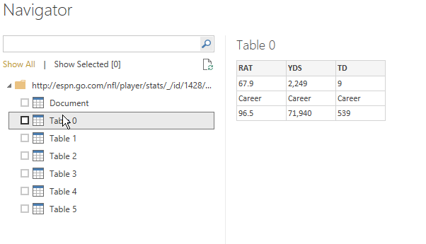
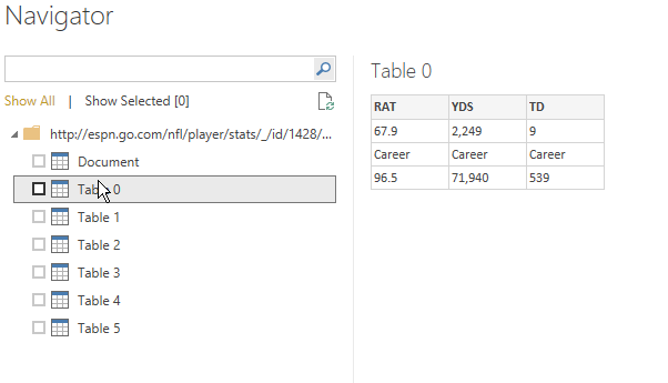
    Now, I can click each one to see what data this is. This isn’t what I want

    2016-02-10 14_16_32-Calendar

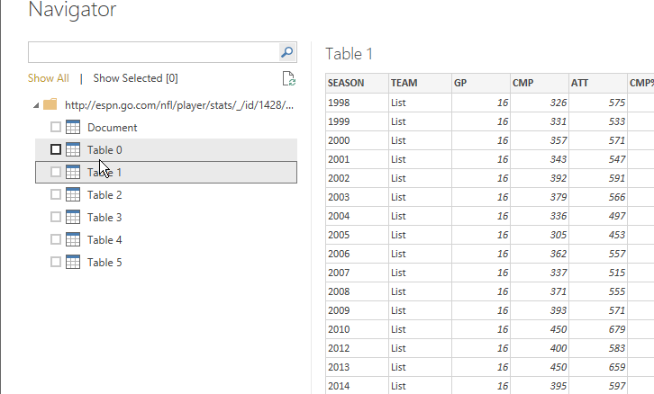
    But this is.

    2016-02-10 14_16_37-

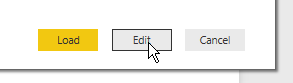
    I now click “Edit” at the bottom to clean my data. I could just load it, but there are a few issues.

    2016-02-10 14_16_47-Untitled - Power BI Desktop

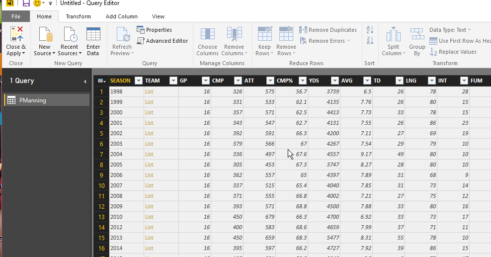
    I see all the data in the designer, and I have lots of options for working with this data.

    2016-02-10 14_17_11-Calendar

    First, since I’m going to do a comparison, let me rename the table.

    2016-02-10 14_17_02-Untitled - Power BI Desktop

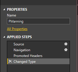
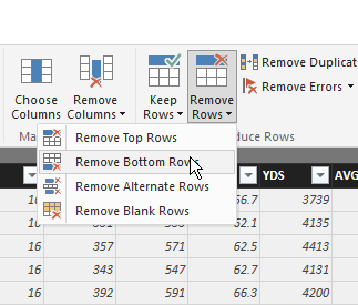
    Next, I see the steps below the name. I’ll add more steps, but I’ll do this in the designer GUI. First, let me remove the last row, which is a career summary.

    2016-02-10 14_19_28-Calendar

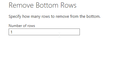
    In this case, I’m only removing one row.

    2016-02-10 14_19_36-Calendar

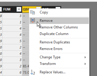
    Now, I want to remove a couple columns. In my case, I don’t care about a few of the data items, so I’ll pull them away. I can right click a column or choose “Remove Colums” in the ribbon. Either way, I get rid of QBR and Team.

    2016-02-10 14_20_50-Untitled - Query Editor

    Now I’ve got a nice year by year summary of Peyton Manning’s career. When I close and apply the query, my data is loaded into a data set for use by my Dashboard. I can then repeat this, and I’ll have two sets of data.

    And, here’s my PowerBI Dashboard. It’s not terribly useful, or interactive, but it’s got data from the web that I didn’t have to copy or move.

    https://app.powerbi.com/view?r=eyJrIjoiMWNmYzBiYjUtMTU3Yi00NWFhLWFiZjQtNTY0NzY4NDRkZTJmIiwidCI6IjY2NjBkOGZkLTJjNmItNDg0Mi1iZmZmLTcxOTY1YzE2NTczYSIsImMiOjN9