Tag: Power BI

  • The PASS Data Community Summit On Guy in a Cube

    I’ve known Adam and Patrick for a long time and I’m thrilled with the content they produce on their Guy in a Cube show. It’s a great resource for anything Power BI, and now, starting to cover Microsoft Fabric.

    I’ve been on their show before, but we did a new episode recently, talking about the PASS Data Community Summit 2023. They are teaching a pre-con session on Fabric and I recommend going to this one if you have a need to do data warehousing in Azure.

    Give the show a watch, and I hope to see you in November in Seattle. It’s a great trip for both you and your employer. You’ll get a lot of value from the event and I’m sure you will bring some knowledge back to your team.

  • Power BI and Git

    When Power BI was released, I was working with customers to try and adopt DevOps for their database code. At that time, I thought the Microsoft developers had made an extremely poor decision with the PBIX format in that it wasn’t well suited for version control. In 2011, when it was first released, we not only had decades of knowledge about version control and the power of DevOps, but we’d also been living with the extremely poor format of code in Integration Services packages (among other data tools), that were poorly suited for understanding in version control systems.

    Power BI has grown, and with the Fabric announcements, there are integrations with git for your workspace. There is also a Power BI Developer mode that saves your project in a folder structure rather than one file, which is better. I’m not sure it’s great, especially if it doesn’t enforce text in a way that ensures a developer can easily see changes between settings and understand them. I can certainly diff the XML in two SSIS packages, but that doesn’t mean that it’s easy to understand what has changed.

    I think all modern tools used to build software, including the various reporting systems, need to be built with a pipeline and team development in mind, and set up to ensure that multiple developers can review code in some sort of Git-pull-request format. For those tools that use GUI formatting, I’d hope they separate out GUI elements from others, as no one needs to pull request a change that moves a visual box on screen left 2 pixels. However, if you change the OnError response or formula inside the box, that should be easy to see in code.

    This isn’t a simple concept to design for, especially for software that is based on a novel idea and is often built by a small team. However, periodic review of how the software stores changes and how a less experienced developer might review those changes is important to ensuring that our tools scale to the modern needs of distributed team development where our collaboration is often through protocols like pull requests.

    Steve Jones

    Listen to the podcast at Libsyn, Stitcher, Spotify, or iTunes.

  • Select All in a Power BI Slicer–#SQLNewBlogger

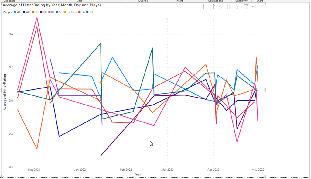
    One of the things I’ve been working on this year is a Power BI report for the kids I coaco in volleyball. As a part of this, I want to be able to show all kids, or a few kids, in relation to each other.

    This post covers enabling this for a Slicer on a report.

    Another post for me that is simple and hopefully serves as an example for people trying to get blogging as #SQLNewBloggers. Here are some hints to get started.

    Adding the Slider

    I have a basic report with a line graph. It looks like this once I’ve added in the value to capture at the Y, the date as the X, and the player as the legend.
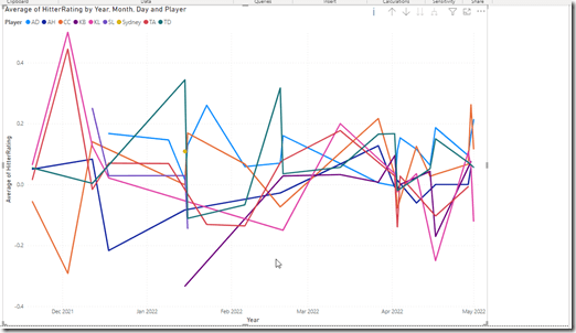
    2022-11-06 10_16_41-2022_16Select_Online - Power BI Desktop

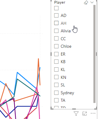
    I’ll add a slicer to the report and drop the players in there. I see the players, but I don’t have an easy way to select all of them.
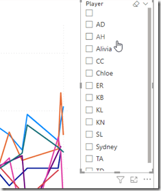
    2022-11-06 10_17_00-2022_16Select_Online - Power BI Desktop

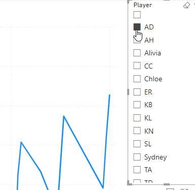
    I can select 1, but if I select another, the report changes. I can CTRL+select to get multiple players, but I want to easily get everyone.
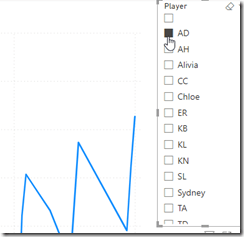
    2022-11-06 10_17_14-2022_16Select_Online - Power BI Desktop

    I knew this was possible because I’d seen other reports show this. I didn’t see anything obvious, so I actually had to search the docs and found a note that explained how to enable this.

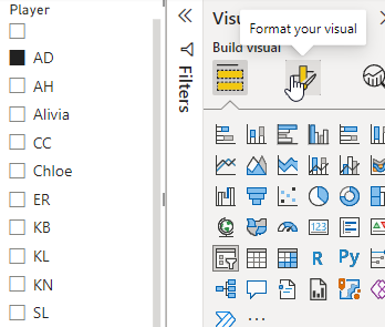
    If I click the slicer, I can then select the  Format option on the right, which is the center icon at the top of the visuals pane. You can see the tool tip below.
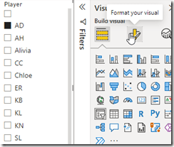
    2022-11-06 10_17_22-2022_16Select_Online - Power BI Desktop

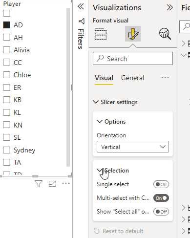
    Once I do this, I need to expand the Slicer Settings and then the Selection area, as shown here.
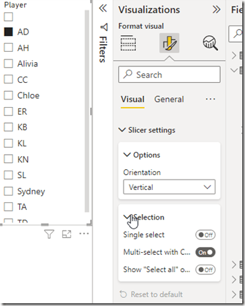
    2022-11-06 10_17_30-2022_16Select_Online - Power BI Desktop

    Now I want to click the “Show Select All” button.
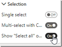
    2022-11-06 10_17_35-2022_16Select_Online - Power BI Desktop

    Now my slicer show a Select All at the top.
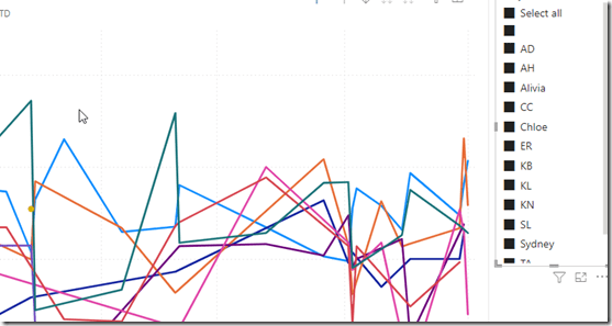
    2022-11-06 10_17_45-2022_16Select_Online - Power BI Desktop

    Easy.

    I found that when I have a few slicers, which I wanted for this report, it was easy to add them all, then do the formatting for one. If I clicked another slicer, I was in the same format spot and could enable SELECT ALL for the next one. For me, I actually had 3 slicers, so it was nice to format them all very quickly to add this option.

    SQL New Blogger

    This is a really basic post, but it was also something that I didn’t intuitively figure out. I had to research a bit and look around. That’s the skill that many employers need and want.

    This also might trigger someone to ask me about Power BI and what I know, which gives me the chance to talk about the learning and experimenting I’ve done.

    You could do this as well. It took me about 15-20 minutes to grab screen shots and write this.
  • Solar Production After 5 Months in Power BI

    I’ve been tracking my usage and comparing that with the estimates for my solar power system. I wrote about the database design and tracking the usage and some of the estimates.

    In this post, I want to look at the reporting in Power BI. Here is my refreshed comparison report as of Jul 31.

    2022-08-01 10_17_38-SolarProduction - Power BI Desktop

    I have 3 sections here. At the bottom right is a table with a range setting that shows raw data. I need to write about the import process for this data, but that’s for another day.

    At the top, I have the running total of production (light blue) and estimated production (dark blue). The first month or so we were close to the estimate, but we started to outperform the estimate regularly, which is good news. The Tesla wasn’t in the model or estimate, and it uses some power, so it’s good the system is ahead.

    The bottom left is the month by month comparison, which you can see is a fairly steady overproduction each month.

    The configuration is fairly simple for this report. For the line chart, I’ve set the x-axis as the date. My Y-Axis has the sum of both of the raw production numbers. This gives me a running total across time.

    2022-08-01 10_32_02-SolarProduction - Power BI Desktop

    The lower left month by month bar chart is similar, but I’ve added the month, which separate this into buckets.  This lets me see if a particular month’s comparison is hidden in the line chart by the long term running total.

    2022-08-01 10_36_16-SolarProduction - Power BI Desktop

    I can’t change much, but this does help me to look for anomalies and possible production issues. Perhaps a panel isn’t performing or there is another issue. By glancing at this every few days, I can decide if I need to look at more detail on the system.

    Hopefully the company doing monitoring would detect issues, but this is a good double check for me and it also gives me long term data backup in case they have issues.